

In this new kind of article I am going to produce style and design tips for people who are interested in some of the design features I use on my website. These differ considerably from my tutorials in the sense that they are not meant to be tutorials on learning web design and development but to give you an idea of some cool things I know.
Not too long ago, I wrote about how we can fix fragment identifiers in URLs with a fixed menu. Now this article will continue that trend with a focus on more design features.
Vertically align in the middle
No I am not talking about the CSS vertical-align property. I'm talking about vertically aligning something like a div in the middle of it's owner. This is actually one of the most overseen tweaks that can be applied using CSS. Many websites I've observed use JavaScript to calculate the middle whilst others just give the top property a value of 50%.
We know how easy it is to make the div centered horizontally since we just use magin:auto. Note this is only for absolute positioning, but since that is most likely what you are trying to achieve it makes sense.
This method was inspired by Smashing Magazine who outline it perfectly.
Firstly, it works on the basis that the margin is set to auto. By doing this both margin-top and margin-bottom are set to 0.
Secondly, remember that an absolutely positioned element with a width will only be the size of the width, regardless of whether the left or right values are set to 0, it will not stretch it's relative parent. The same goes with the height, so here we define the height of the element and set the top and bottom values to 0.
Notice the green box is always in the middle regardless of the height of the textarea element.
Finally, the CSS code is as follows:
.vertical_middle_align{
    position : absolute;
    top : 0;
    bottom : 0;
    margin : auto;
    background : green;
    height : 5px;
    width : 5px;
}
Indeed this code will force the browser to push it to the middle. I'd like to thank Smashing Magazine for this solution, since I had a different way of doing it before that I believe was less effective (using tables).
Outstretch boundaries
Sometimes you will need to leave the original boundaries of an element but not make the element absolutely positioned. You can see this with my h2 elements across my website, since all other elements are pushed inward slightly. This is because there is padding applied to my content. The h2 elements however do not follow this.
They do this by having a negative margin.
So lets assume we have a padding of 50px on each of the sides. The box model would look like the following:
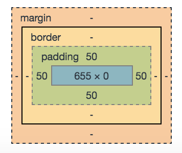
The box model
Now we can leave this box provided it doesn't have overflow set to hidden. If it did, anything that outstretches it's boundaries would be hidden.
We can then give the h2 a negative margin to make it look as though everything has been given a margin-left value of 50px.
This is a good way of doing things because of two reasons. The first of those is that giving padding or a margin to everything but the h2 elements (so that the h2 elements remain leftward of the p, img etc elements) would need to be done with the * selector, this means that you are applying it to everything rather than as with the h2 element, just one element.The second reason is that when an element wants more padding or more of a margin on the left for instance, it would have to be 50px + the desired margin. This complicates things, grossly.
I think this solution works slightly better than the to do the reverse and apply margins or padding to every element and then remove it from the h2.
Styling radio buttons and checkboxes
This is one of the things I get asked the most by friends who are interested in doing this too. Before I get started on this, I just want to say how terrible it is that browser do not offer a direct way of styling these elements, but I am glad that CSS provides a very functional way of doing this.
The trick works like this:
- An input element and a
spanelement are wrapped together in alabelelement - If the browser meets an
inputelement of type checkbox or radio, it sets it'sdisplayto none. - If the user clicks on the
span(because it is within alabelwith the input element) theinputelement changes, and so too will thespanto reflect this - When the form is submitted, the
inputelement will be submitted and it's value will reflect that of thespanbecause it would change automatically when thelabelis clicked.
Let's take a look at some CSS for this:
label > input[type=radio], label > input[type=checkbox]{
    display:none;
}
label > input[type=radio] + span, label > input[type=checkbox] + span {
    border-radius: 50%;
    background: #ddd;
    position: relative;
    display: inline-block;
    height: 20px;
    width: 20px;
}
label > input[type=radio] + span:before, label > input[type=checkbox] + span:before {
   border-radius: 50%;
   content: " ";
   position: absolute;
   top: 2px;
   bottom: 2px;
   left: 2px;
   right: 2px;
}
label > input[type=radio]:checked + span:before, label > input[type=checkbox]:checked + span:before {
   background: #f60;
}
It's not the nicest of ways to have to do this, we'd really like to be able to simply style the element itself.
Let's look through the code. First off, hide the input elements that meet the criteria. Secondly, set the span to have a border-radius value, height, width, background and set it to be a relative element and an inline-block (otherwise the height and width do not do anything, since inline elements cannot have this). Thirdly, we need to have some way of showing the element is checked (we could simply change the background colour of the span, but it's more effective to put a big dot in the middle) and in this case we use the :before pseudo-element to create an empty pseudoelement within the span. It will by default have no background, thus will be transparent (and therefore looks like it's not been checked). This element will be positioned absolutely and have a border-radius. Finally, when the input element is checked set the background colour of the :before pseudo-element, thus showing it as a big orange dot.
If you'd like to try it, just try out some of the checkboxes or radio buttons on my website since they all use this method.
And there you go, my first of (hopefully) many of these helpful tips for web design and development.