I'm very happy to say that a big update has just been finished in relation to my website. I had been flattening some elements of my website and since becoming a far more competent designer, I very recently came up with an idea.
In 2014, I started to building styles that unintentionally left my website with no singular style, towards a much more gradient-based website. Early this year I pushed this further and my site was full of gradients and so on. Gradients are nice and everything, but they make things difficult when you want a consistent style.
Today and yesterday, I began to work on a new interface, known as 'Silver Orange' since the colours of choice and grays and oranges (there are very few other colours in the range).
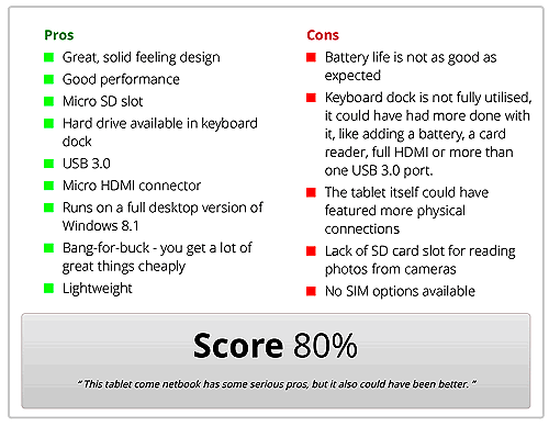
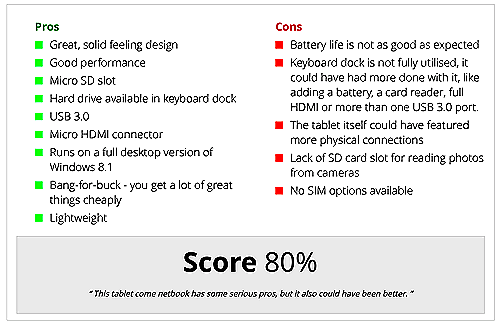
Allow me to show you some examples.
The above images show the conclusion box on my website. You can find this in articles and reviews. It's new look removes gradients and flattens the interface by removing curved borders and box shadows.
The buttons are obviously more flat than they were before and the same goes for the whole form input design. I've also dropped the name Epic Form which has been in use since 2013.
The new bibliography fits in better with the new design
As well as flattening the interface of gradients, a lot of curved borders that have existed for the last few years have been removed and replaced with nice borders.
Finally, I have made my colour scheme far more obvious and consistent. You should notice this pretty much immediately.
So there you have it, the latest update to my website.


