I'm afraid I had no real choice but since the information architecture on my website has changed significantly, I've had to remove all comments relating to the old architecture.
A significant number of comments were on articles and reviews and unfortunately have had to be removed.
I'm very happy to say that a big update has just been finished in relation to my website. I had been flattening some elements of my website and since becoming a far more competent designer, I very recently came up with an idea.
In 2014, I started to building styles that unintentionally left my website with no singular style, towards a much more gradient-based website. Early this year I pushed this further and my site was full of gradients and so on. Gradients are nice and everything, but they make things difficult when you want a consistent style.
Today and yesterday, I began to work on a new interface, known as 'Silver Orange' since the colours of choice and grays and oranges (there are very few other colours in the range).
Allow me to show you some examples.
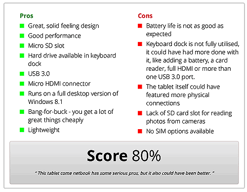
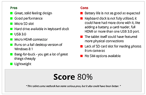
The above images show the conclusion box on my website. You can find this in articles and reviews. It's new look removes gradients and flattens the interface by removing curved borders and box shadows.
The buttons are obviously more flat than they were before and the same goes for the whole form input design. I've also dropped the name Epic Form which has been in use since 2013.
The new bibliography fits in better with the new design
As well as flattening the interface of gradients, a lot of curved borders that have existed for the last few years have been removed and replaced with nice borders.
Finally, I have made my colour scheme far more obvious and consistent. You should notice this pretty much immediately.
So there you have it, the latest update to my website.
In just under one hour, the desktop version of my website will change to the Christmas theme for everyone! Since this is only the second year of me doing this, 2014 being the first, I am hoping to see the changes I have made over the last year to make the system flawless in action.
Well since that's now past midnight on Halloween (gosh how time flies when you get to my age!), my Halloween theme is now officially no longer active.
I hope you liked the new features I added to the website for Halloween!
It's that time of year again!
My Halloween theme is now active as it activates on the 15th of October every year. I mentioned before how this was done with JavaScript, since then in an attempt to cut back the JavaScript on my website I have moved this to a server-side functionality. This should in turn reduce the amount of stuff downloaded.
Enjoy
I don't often post now about updating my website but as this is the first real change to my website since I designed the HTML structure of the page in November 2012 in version 2.0 of my website I am putting it up so I can remember this day.
You may know that my website is built with a structure that keeps the content and sidebar separate. This structure has followed the following pattern (each of these are IDs to divs on the page):
html > body > #container > #page > #main_content > #textZone > article > *
Where the * represents all of the content of the page. Now I have decided to drop #textZone and #main_content is now just #content:
html > body > #container > #page > #content > article > *
This shorter name reduces the size of the CSS file by ~120 bytes and reduces the JavaScript file by ~100 bytes. It also reduces the number of elements on the display.
Today my tutorials have finally become recognised! An online company known as Udemy sent me this email:
Hi Jamie,
I was doing some research for our students here at Udemy on people using PHP resources and when I came across your site, saw you were using the tutorial from w3schools.
We really like your resource, and actually created our own that we think is a perfect supplement! This PHP tutorial is text-and image-based, easy to search for quick answers, and super helpful for anyone: as a base for learning or as a reference guide.
Do you think this would be a helpful resource? If so, please use it on your site. I'd love to see more people learning PHP!
Thanks so much,
Tiffany
This makes me feel so proud of what I have achieved with my website and will go on my list of recommendations!
I am very, very happy to announce a new menu on my website! This is the fifth new menu on my website and this one is absolutely here to stay!
The reason I know this one is staying is because I made it - meet JBBar.
As part of my Neutral Web controls I decided to create a menu that is responsive and looks similar to my previous one.
I previously used jQuery SmartMenus, which gave me inspiration for my own menu. The theme is designed to look suitable for BootStrap but also to give maximum flexibility.
The source is written in JavaScript and SCSS, so it's easy to modify. In comparison to SmartMenus, my menu is so lightweight that it barely makes a difference including it - just 272 lines of code in the SCSS file at the time of writing this post.
In order for me to get SmartMenus to work on my website the way I wanted, I had to do a lot of alteration to the code. I also had to use the BootStrap theme and cut it down as much as possible to make it work as I needed it to. My menu is so simple that it just gives the basic JavaScript functionalities and the core of what is needed. It's also miles easier to update and tailored to how I want it.
You probably will not notice any difference in the design. The differences are so subtle that perhaps the change was only necessary for back-end reasons and not for front-end aesthetics.
There is still a lot needing done on the menu, but the general front-end functionality is done. You will notice it is now available across the whole website.
I also have added a new section to my menu called Projects. This section currently redirects you to the appropriate pages on my website but soon will be a dedicated section again, specifically for projects that are current or completed.
I have begun work on my new MySQL tutorial. This is the fifth tutorial on my website.
On top of this, I have created a collection of really colourful icons for each tutorial based on the colours associated with the languages.
I hope you have enjoyed my tutorials so far and that the MySQL tutorial is as enjoyable!
Well, despite the new changes coming in on Monday last week, I have had several messages saying they liked the grey design on my website and did not like the dark sidebar I was testing.
I am happy that I received this feedback as I also agree with those people since going back. Thankfully, I left the CSS in the file but gave the sidebar a new class that changed it to the dark mode.
I came up with a slightly new design for the sidebar just this afternoon that I feel makes a much flatter, better design. I hope you like this as this should be the final modification to the website for a long time.
Most of my focus is on improving my blog at the moment.
Anyway, I'm off to enjoy the remaining three days of my holidays now!


