Let's be clear here; for the majority of Mac users, Thunderbolt is only ever used as a display connector, only utilising the DisplayPort properties of this interconnect.
Apple and Intel's joint venture surprised many and was one of the key reasons I bought myself a MacBook Pro when I did. Since the MacBook Pro I originally owned (late 2011 13" Thunderbolt version), Thunderbolt has progressed a long way. Not only has speed been increased, but in terms of the devices using it. Nowadays, it is not surprising to see a docking station adding more video ports, more USB 3.0 ports and gigabit Ethernet to a laptop which has but a few physical connections. Thunderbolt 2 was released in 2013 with a maximum theoretical speed of 20Gb/s compared to the original Thunderbolt specification which could achieve 10Gbps. This was due to the fact that instead of using PCI-Express version 2 in a single channel, Thunderbolt 2 used PCI-Express version 2 over a duplex channel (allowing communication both ways, or combining them into a single channel). PCI-E version 2 achieves 500MB/s per lane, equivalent to 4Gb/s over a single lane. Thunderbolt uses 4 PCI-E lanes and can achieve 10Gbps with this. Thunderbolt 2 making it bi-direction achieves double the speed.
As many of you will know (if you read my website), my biggest interest in computing is physical computer connectivity, which I have had since about the age of 7 or 8 (where I became obsessed with PS/2 and parallel ports).
To me, physical connectivity is the way forward, wireless is a step backwards (in terms of data, not networking, although I still use almost all of my devices through our rather dated [1997/1998] network in the house which only receives moderate upgrades from time to time). This is why I have backed FireWire and Thunderbolt over many wireless standards.
At the same time, Intel has been busy (again working with Apple) developing USB-C, a full-speed USB 3.0 port which has the physical footprint of a Kensington Lock, allowing computers to get thinner and thinner as well as the ability to send video signals (including DisplayPort) and power (back to the device) over the one cable.
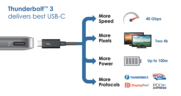
Combine USB-C and Thunderbolt together and you get Thunderbolt 3. Thunderbolt 3 supports PCI-Express 3.0 which achieves 78.8Gb/s or 985MB/s per lane. Thunderbolt 3 itself is given a maximum speed of 40Gb/s, which is a crazy amount of speed. What this now means is that a PCI-Express version 2 graphics card could be used external through the Thunderbolt 3 interface with no real problems. Intel even demonstrated this with the release of Thunderbolt 3.

Thunderbolt 3 will be extraordinary (Sourced: http://uk.pcmag.com/laptops/42408/news/thunderbolt-3-combines-with-usb-c-to-form-a-truly)
What I am really hoping for now is Apple to release a USB-C-Thunderbolt 3 combination display that also features more than one damn input (this is the reason that I still do not have one of these displays and probably never will). This way they could ditch the MagSafe power lead and replace it with the single connector and it really would be the most fantastic way to dock your Mac.
Other than that, the bonus speed Thunderbolt 3 offers would be nice too, but perhaps not worth the extra money for a new computer at the moment.
To me personally, the release of USB-C was one of the most important releases of the last decade due to the fact that it really could become the connector that appears everywhere.
JBlogs is now available to download from my website. As it is still in alpha/beta stages you will need to login/register to download it.
As I have not worked on JBlogs for about 4 or 5 months (getting lazy or just working on other projects), I decided it was time to get back into the swing of it again.
Today I am happy to say that JBlogs requires much less to setup and is better designed. As a result, I have got rid of the custom footer and custom headers. What you do now instead is define a PHP file which contains your own header such as this one below:
<?php
    $no_title = true;
    $expires = true;
    $math = true;
    $title = $title;
    $desc = $description;
    $head = $stylesheets;
    include $_SERVER['DOCUMENT_ROOT'].'/assets/php/head.php';
?>
This example is using my DragonScript to power the blog: it points the JBlogs variables ($title, $description and $stylesheets) to my own DragonScript. For the sake of going in to too much detail here (more will be on DevNet), this is how it could be used in a standard HTML page:
<html>
    <head>
        <title>
            <?php echo $title;?>
        </title>
        <?php echo $stylesheets;?>
        <meta name="description" content="<?php echo $description;?>">
    </head>
</html>
The foot can also be defined on it's own now as well. So the foot just points to the footer defined on the website. This allows JBlogs to integrate with your website from a very quick to create script.
I will put the latest version up as soon as I have tested it works absolutely as expected!
I have begun work on my new MySQL tutorial. This is the fifth tutorial on my website.
On top of this, I have created a collection of really colourful icons for each tutorial based on the colours associated with the languages.
I hope you have enjoyed my tutorials so far and that the MySQL tutorial is as enjoyable!
Well, despite the new changes coming in on Monday last week, I have had several messages saying they liked the grey design on my website and did not like the dark sidebar I was testing.
I am happy that I received this feedback as I also agree with those people since going back. Thankfully, I left the CSS in the file but gave the sidebar a new class that changed it to the dark mode.
I came up with a slightly new design for the sidebar just this afternoon that I feel makes a much flatter, better design. I hope you like this as this should be the final modification to the website for a long time.
Most of my focus is on improving my blog at the moment.
Anyway, I'm off to enjoy the remaining three days of my holidays now!
Okay, so I'm one of those people who was prepared to wait until Windows 10 was ready for my computer rather than trying to install it myself (well actually I did, but the thing turned into a nightmare, failing three times due to IMAGE_WRITE_FAIL, UNPACKAGE_FAIL and IMAGE_CORRUPT on each occasion, even using a different image each time).
I decided on July 29th to wait for it on my other computer and then on August 5th I decided not try and install it again on to my other PC until it was officially ready.
Nonetheless, two weeks later I still have not been informed that it is ready to install on either of my computers - my custom built i7 machine with a Radeon R7950 with nothing out of the ordinary and my Asus convertible tablet, released only in October 2014.
To tell the truth, Windows 10 looked/looks like it will be worth the upgrade (afterall, I hated Windows 8 as much as anyone).
So where are my upgrades? (if this was Apple, I'd already have my update downloading but it would still have four days left to finish downloading!).
I sometimes just sit down and look through my own website for criticism rather than anything else.
My website has become the HUB of everything I do now. You can find out about me, read tutorials by me, find my CV, find photos of my places I've been, my life, family and pets and more, access my university stuff, download and read about my software, here what I have to say and more.
I don't often sit down and review my website but as I've got a chance, I'd like to tell you the truth about some recent events.
As one person knows, the person I know who cares about my website and one of my best friends in life, I considered completely getting rid of all the work on my website and changing my website entirely to Bootstrap, convinced that it was time for a major change.
To me now, the very fact that I was thinking this was even silly. I say this because I now know this website is me. I've built it.
I've had some comments from lecturers, friends and family and lots of others who have said my website is nice. But to me, there is always a need to change it more and more as you will have seen if you come here to view my blog or whatever on a regular basis or something.
The only problem is, whenever I write an article, tutorial or blog post or something, I always get distracted and end up changing something on the site.
I'm trying not to modify my website any more at all - trying to keep it consistent I think is what I'm trying to say.
I'd like to point out that alpha.jamiebalfour.scot, a subsite of this website, is nothing more than a concept - even it's front page explains that I never thought about doing that!
The alpha site never came to be the future of my website. It was overloaded with things I didn't need and it didn't represent me the way my own styled website does.
I am experimenting a slightly new design with the sidebar on my website at the moment.
Instead of the standard white sidebar, I have taken inspiration from one of the websites I built a couple of days ago for a company.
Feedback on that company website has been really powerful - most of which stated they liked dark sidebar and the bright content section. They also said they preferred the left hand sidebar to the right hand sidebar.
All of this got me thinking about my own website design too. So I decided to implement it here too.
For a long time, I have been looking into new ways to improve my website, particularly the desktop website as I really like the mobile and tablet versions of the site (this comes from the fact that they had more skill put into them as I had learned more by then).
My mobile and tablet website stay exactly how they were before - perfect.
If you like or dislike, let me know.
Oh and I will be bringing a new feedback form to my desktop website.
I had been planning a single login system for all for quite some time but now it is finally here!
My single login for all is cross-domain between all of my subsites and both the .com and .co.uk sites. It also works on the blog, so if you are a member of my blog it's easy to login to it now, using the same way you are used to with the standard login page.
For some time I have been noticing that several error logs across my site have been filled with errors relating to attempted header updates in PHP that are failing.
I found out today what the problem is.
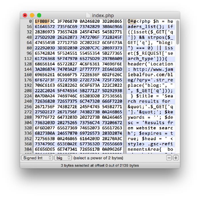
The error for most of them occurs on line 1, and it's because of Aptana Studio saving in UTF with BOM. BOM or Byte-Order-Mark is a single array of characters that is put at the start of a UTF file. The BOM can be seen with a hexeditor such as Notepad++ on Windows or hexdump on *nix machines.
It looks like this:
EF BB BF
Because PHP recognises this as output, it simply leaves it in and therefore PHP flushes the headers and the headers cannot be sent. Don't get fooled by this issue that has had me fooled for months.
There is more information here:
http://stackoverflow.com/questions/8028957/how-to-fix-headers-already-sent-error-in-php
http://ext.raneous.net/post/16512690236/my-utf-8-byte-order-mark-bom-adventure


